Presentation Design
Slide decks for presenting to groups, and for individual viewing
I partner with you to communicate your story, build bridges, and inspire connection by enhancing how you convey your story, guiding you through content development and translating it into a resonant message; creating bespoke presentations that connect you to your audience for fundraising, training, pitch decks, quarterly reports, and more; and redesigning your existing templates to make them shine.
As a multifaceted designer, I add value to your presentations by offering an entire “communications toolbox”: PowerPoint or Google Slides presentations and templates that are functional and accessible, as well as beautiful and impactful, along with graphic assets and design systems for those of you with a DIY spirit; accompanying documentation—takeaways, reports, briefs, and whitepapers—to both fuse and expand upon your message; social media graphics and promotional material to spread your influence; and book design to give your voice a tangible legacy.
I am energized by the growing enthusiasm, confidence, and successes of my clients, having provided them with the visual communication tools they need to do their very best.
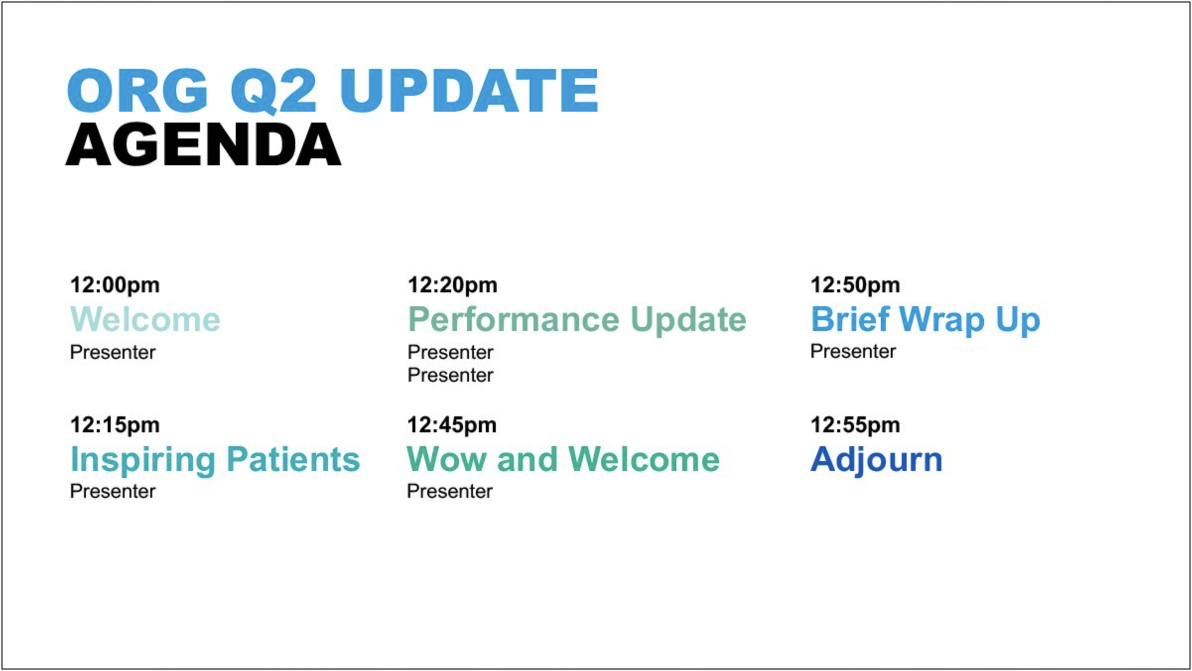
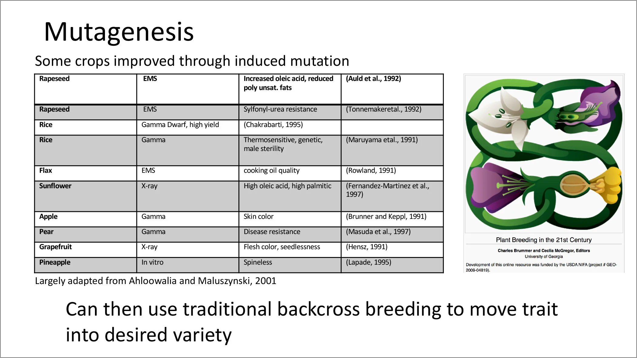
Mayo Clinic Center for Digital Health | Quarterly report presentation deck
Senior-most medical staff had been working in an ad hoc deck that contained no formatted master and layout template slides nor style settings, inconsistent branding. and little to no coordination regarding content and imagery.
I brought design into alignment with branding, selected more appropriate imagery, provided robust master and layout slides with alternate options, and sampler slides of all layouts containing dummy content for presenters to simply copy-paste their content into the deck. By doing so, this created harmony from slide to slide, and (one presumes!) reduced the presenters’ time working in the deck; plus the warmth and imagery of the design most certainly kept the audience far more engaged.
Project was managed by Chicago marketing agency, MCD.
Here are a few of the “before” slides:
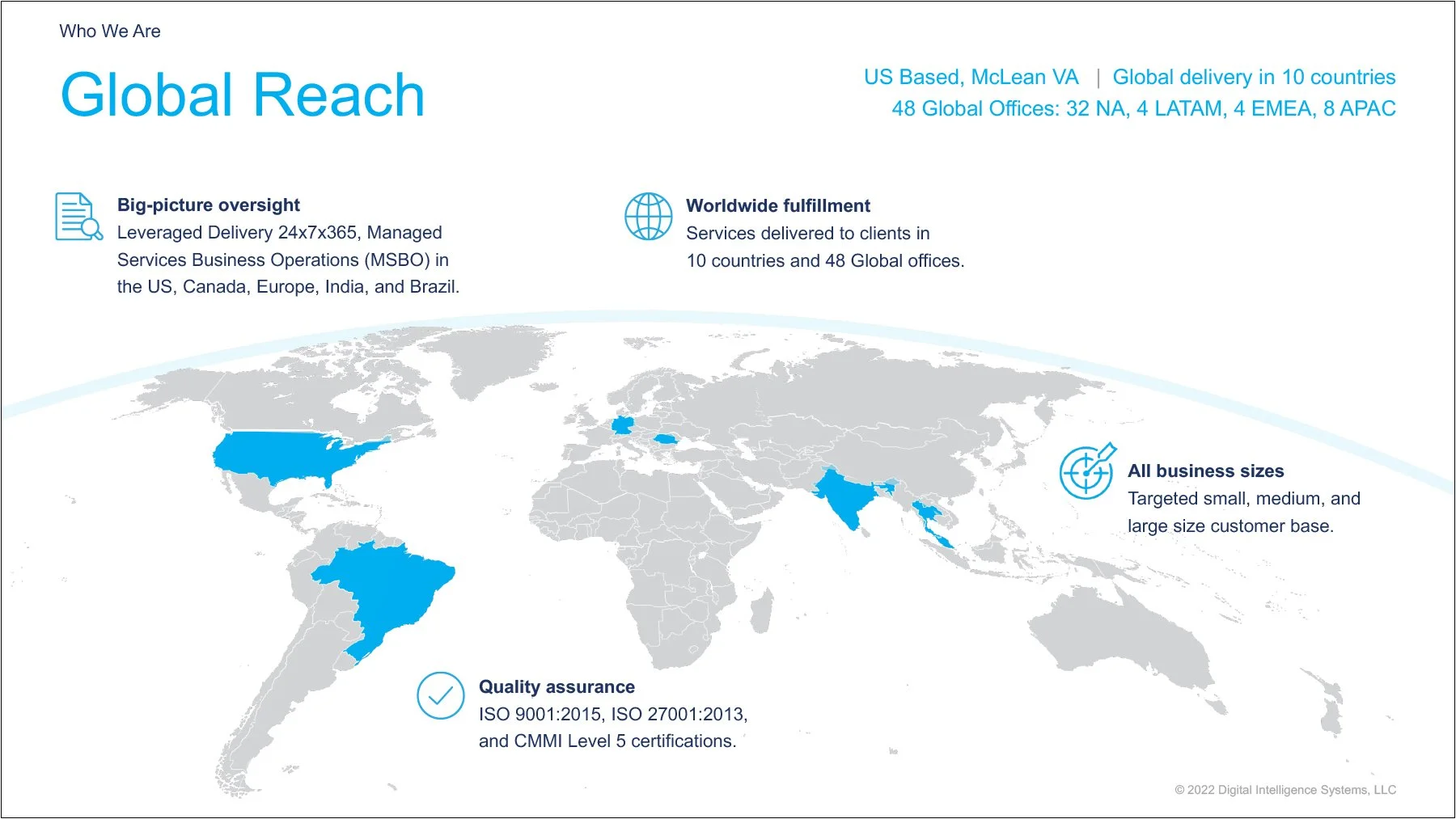
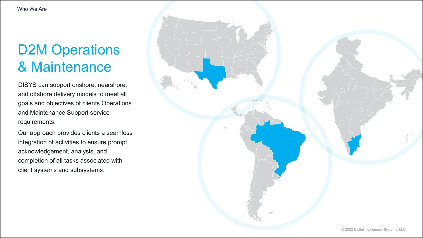
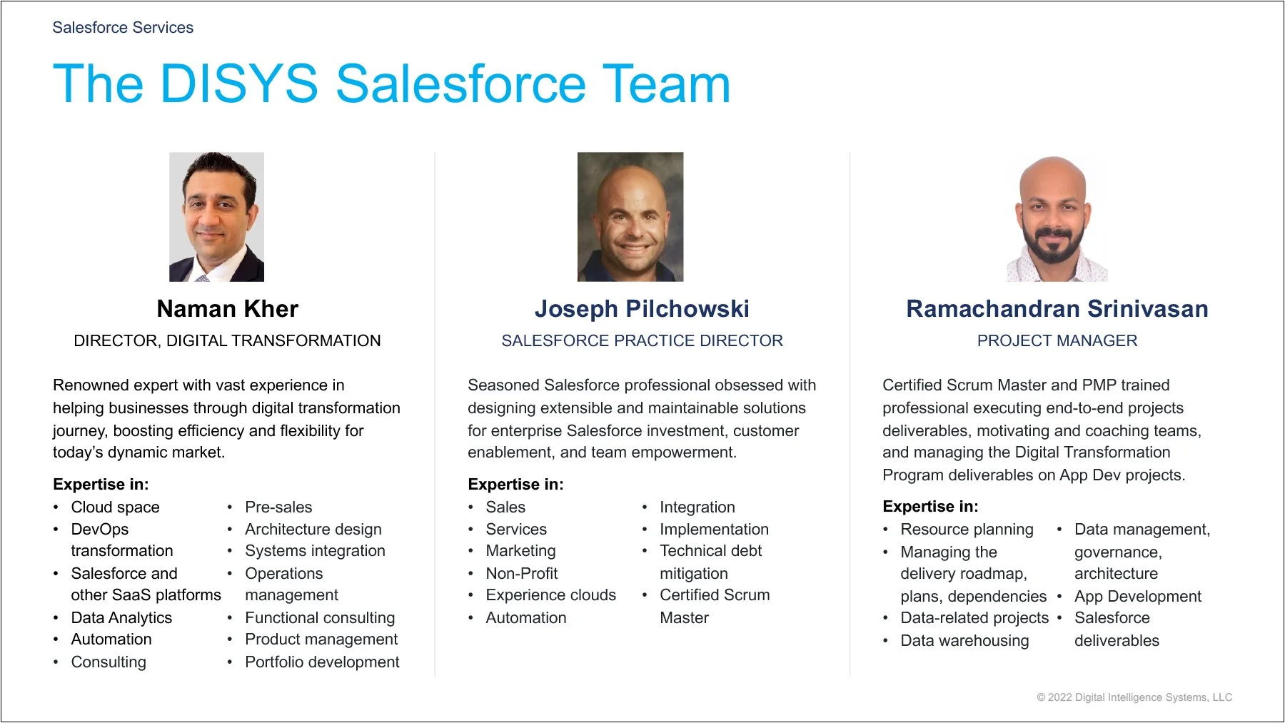
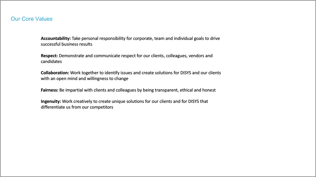
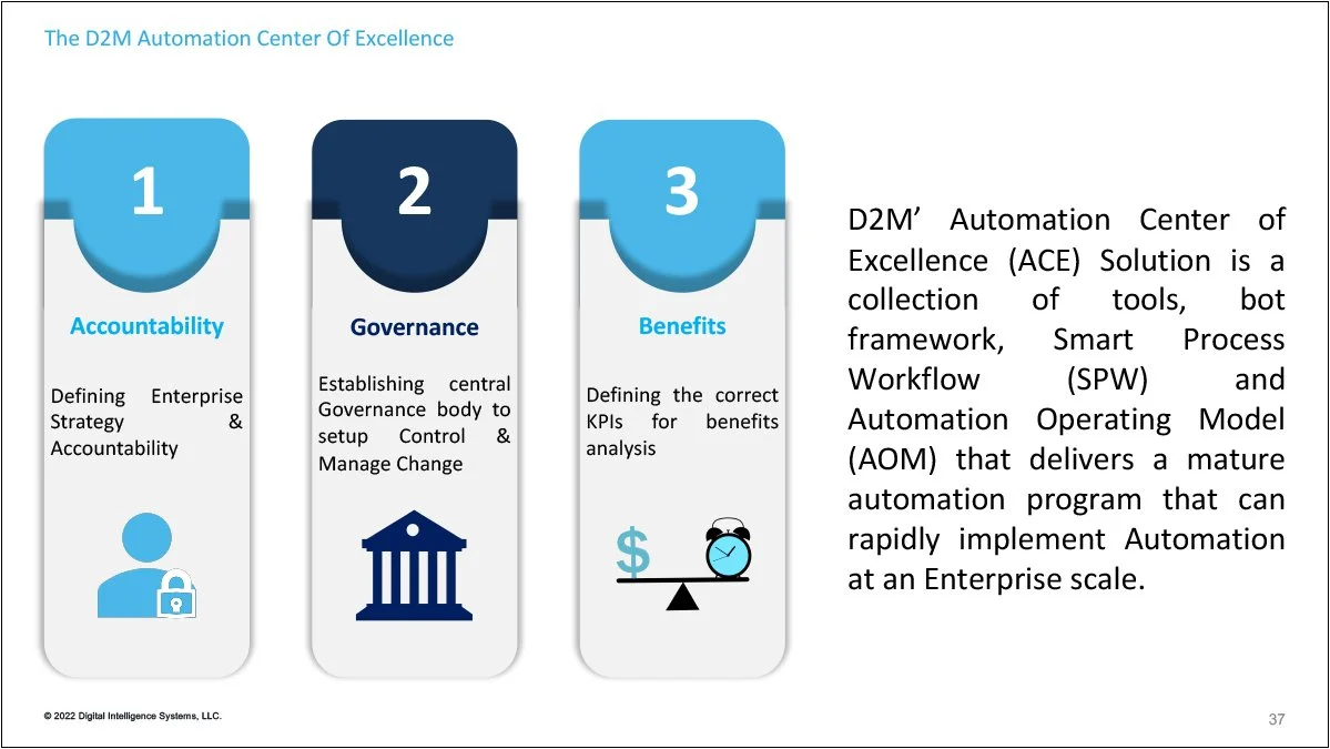
DISYS/D2M | Redesign of large library of pitch deck slides
This project was to uplevel the design of a large pitch deck “library” for Data & Digital Managed Services (D2M), the new Digital Transformations services division of the global IT consulting and business solutions company, Digital Intelligence Systems (DISYS). The library, a web-based content management system (CMS), contains upwards of 70+ mostly locked slides; the sales team selects what they need, then the CMS assembles a pitch deck tailored to the specific prospective client.
The client not only wanted to see brand and design consistency, they hoped I could address the many slides that were over-packed with content, and redesign infographics that weren’t clearly telling the story.
The Creative Director, Allen Breiter, provided the title slide and light input. I completely overhauled the design, extrapolating upon minimal available brand guidelines. Introducing grids and hierarchy and implementing accessibility standards brought in a consistent look-and-feel. In addition, I simplified a good deal of content; and for the many on which all content had to remain, the new design still greatly improved readability, as did adding reveal animations to pace the information. Most importantly, I redesigned all infographics to be legible, consistent, and appropriately formatted to support the data.
In the end, I provided the D2M salesforce with a brand-infused library that will be easier to use and far more impactful.
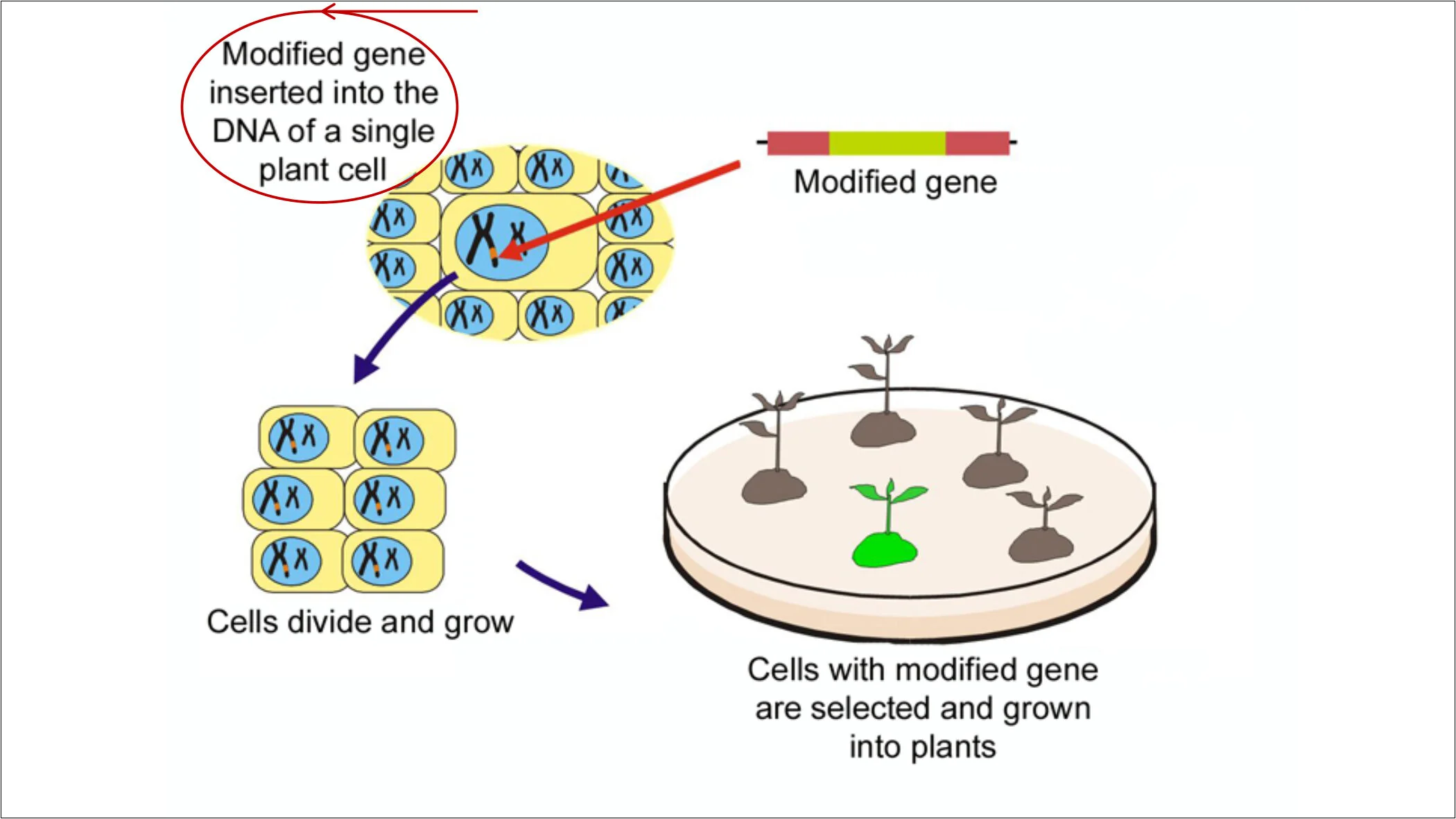
A few of the “befores” for comparison:
Connected Dots Media | Pitch deck and story development
Connected Dots Media, a content-development studio and book packager, needed a pitch deck to convince authors of the value of authoring a print book and working with them vs self-publishing, and to give these authors a better understanding of the process of book publishing.
In addition to design services, I guided the client in developing her story arc and content; created sketchnotes and storyboards to help her “see” the project in its entirety, even before the design phase; distilled the complex process of publishing into friendly, easy-to-grasp visuals that also reinforce CDM’s brand identity; incorporated understated animations and transitions, both to direct the audience’s attention without distracting and to create a smooth presenter experience by automating certain sequences; and provided copywriting that supports, rather than mimics, the client’s script to keep the audience’s undivided attention upon her.
This type of deep collaboration, and offering multiple services, is what builds solid client relationships and ensures my client’s success.
Colorado State University | Redesign of biology course for virtual classroom setting
The COVID-19 pandemic suddenly driving universities to shift to virtual classrooms meant class presentations had to quickly shift in response. For this redesign of a University biology series, I worked with the professor to improve the engagement of his existing content when viewed in an environment filled with distractions.
Under the restriction that all text be retained, the updated design more effectively holds the attention of Zoom-fatigued, multitasking students by incorporating larger text that’s readable even when scaled down to a small corner of the screen, improved sizing and placement of images that attractively convey the slide’s message, and a soothing color palette with a consistent grid that eases eye strain. The addition of pullquote openers and closing summaries inserts necessary pauses and moments to reflect, resulting in the students’ ability to stay tuned in and recall information despite the challenges of their environment.
A few of the “befores:”
Agillect LLC | Brand identity and pitch deck
IT Risk & Security Management provider, Agillect, serves medium-sized corporate clients in financial services and other significantly at-risk sectors.
As a startup, Agillect needed full design support, beginning with their brand identity. The client wanted a shield-type logo to immediately convey “security,” and yet make it stand apart from the plethora of other security company shield logos. They also wanted a visual representation of the three pillars of the Information Security Ethos—Confidentiality, Integrity, and Availability. The pillars are expressed in what could be interpreted as swirling waves, a curved knife blade, or perhaps talons protecting a core that so happens to form an understated shape of a shield.
The logomark then became the visual identity of the presentation. Shown are the opening and first section: the audience sees the logo slide as they enter the room (in person or virtual). When the presentation commences, the logo enlarges to frame the title card, which then fades into the section divider. Another click, and the “3 Main Drivers” slide appears, first just the heading, then each column fades in, one after the other. Subsequent slides are also softly animated to bring in the icon and text, line by line. This animation allows the information to enter at a controlled pace. The section then closes with a question posed to the audience.
Below is an example of original content demonstrating how dense, dry information can be transformed into inviting layouts by using clear text hierarchy and supporting icons. Dividing the information onto an overview followed by each concept on its own slide allows the audience to see the big picture and then explore each point more in-depth. The result is improved audience engagement, and their ability to better receive and recall the information.
The Wright Institute | Interactive collection of obituaries
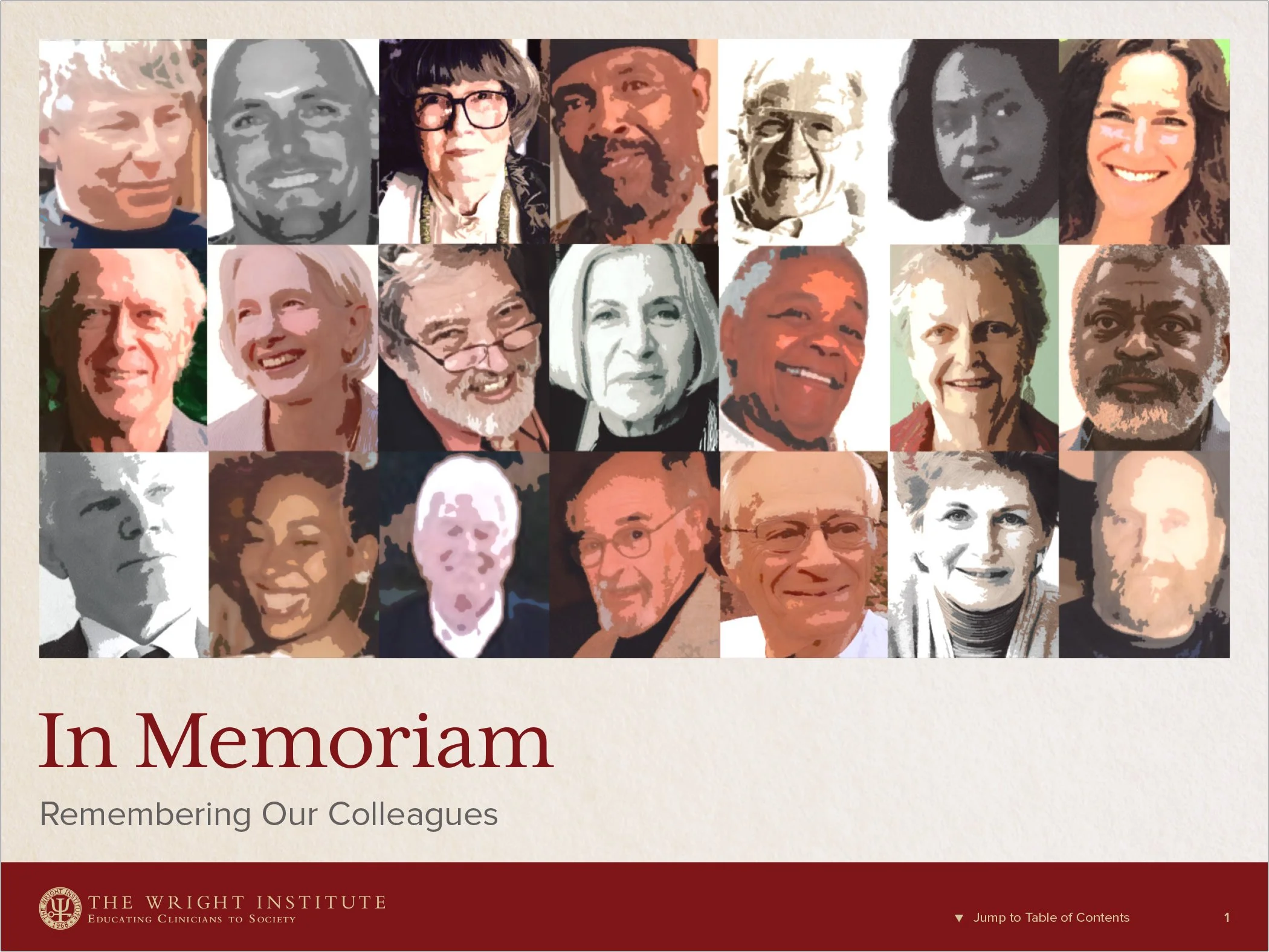
Not all presentations are designed for speakers. This deck was created for viewers to peruse on large desktop monitors at the Institute’s 50th anniversary celebration. Many of the photos provided by the honored colleagues’ families required color correction and heavy restoration—a service I also provide. Applying a stylistic treatment to the title slide unified the vast range of image quality. Attending the event, it was so very moving, witnessing the many guests deep into reading every page of this digital memorial.


